Digital Product Design Studio

HURU entered the market by solving the mystery behind how to access one’s criminal record checks. Driven by a mission to turn once difficult-to-get services (many to do with personal records) into readily available services, their offering continues to expand to credit checks, digital footprint checks and more.
To make record checks feel truly simple and accessible to a predominantly blue-collar target market, HURU needed a welcoming brand and a simple way to communicate their offering and process. Our challenge was to reinvigorate the brand and simplify communication while creating an obvious journey that eases the burden on HURU’s support team.
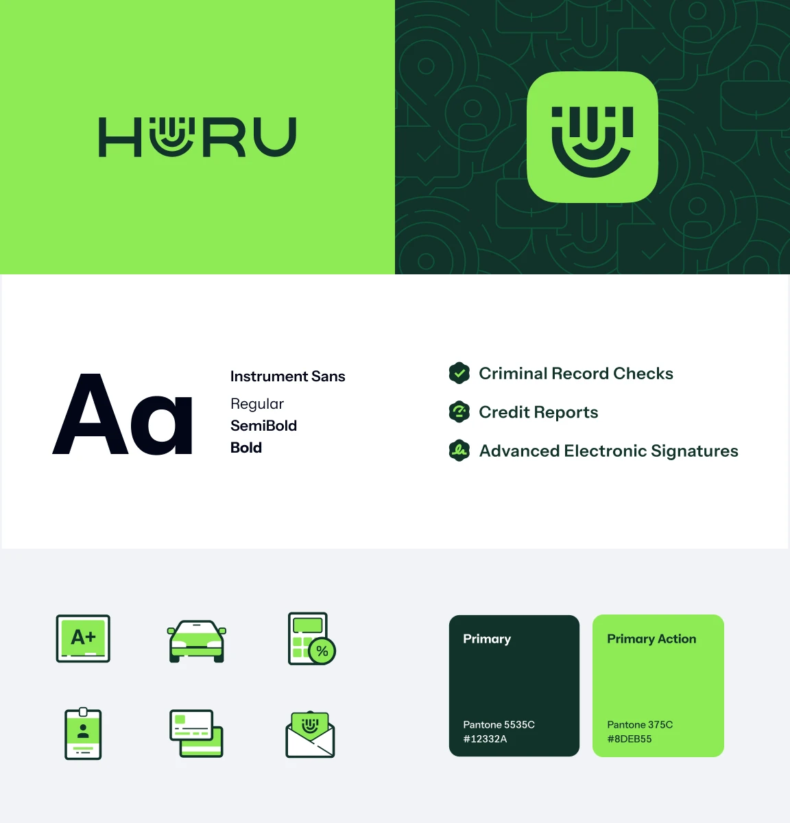
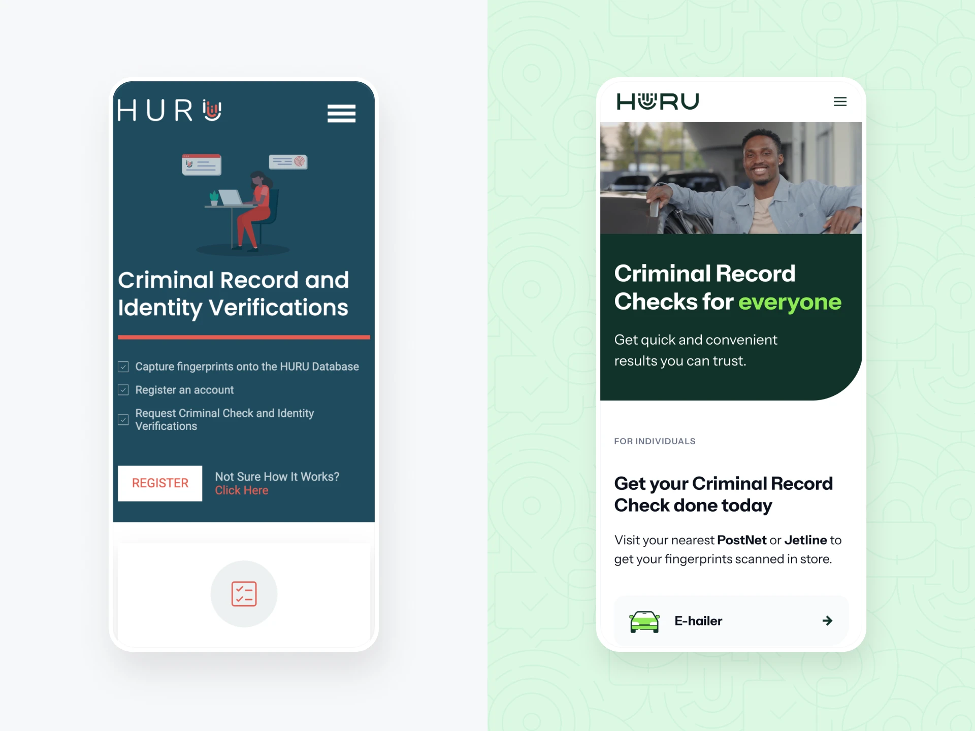
HURU’s corporate brand felt unapproachable and disconnected from their audience. We changed their colour from red ‘danger/warning’ to green ‘positive/open’ to ensure a welcoming feel. We humanised their fingerprint logo to resemble a happy face and created illustrations and icons to add depth, friendliness and excitement.
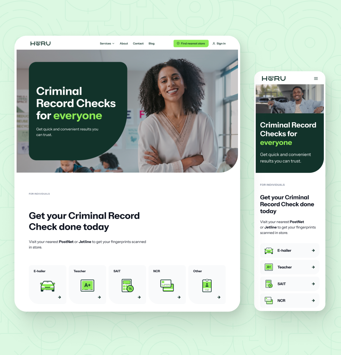
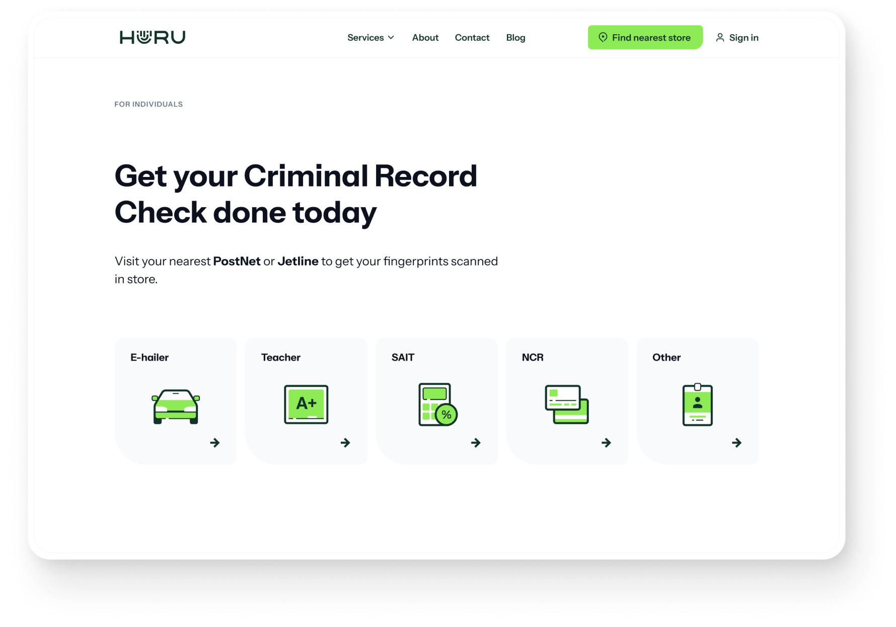
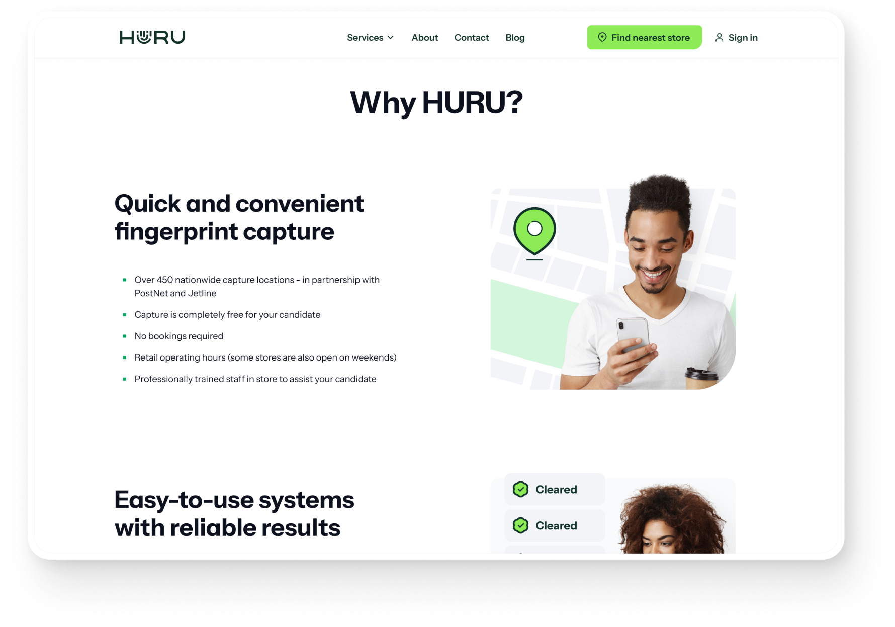
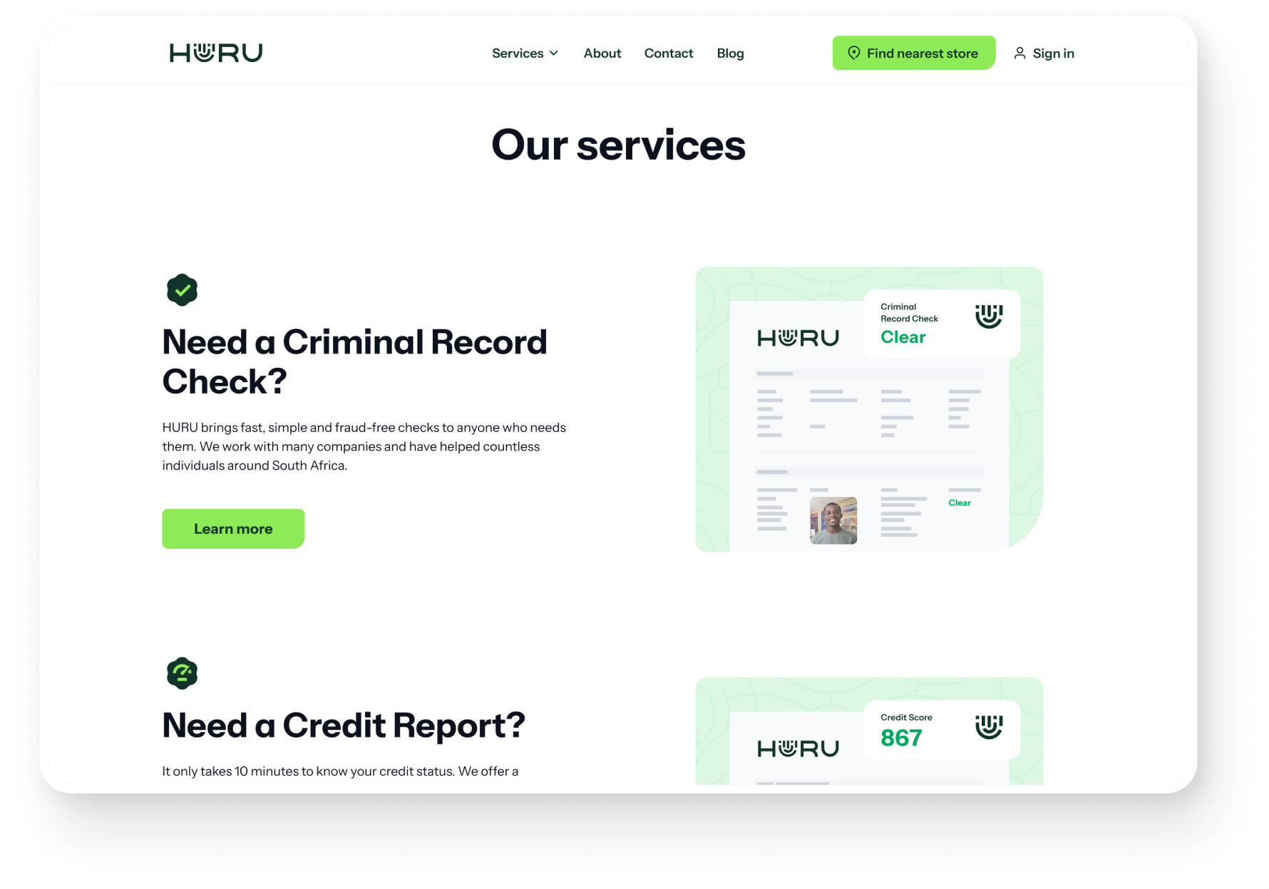
With a simple structure and logical steps of digestible information, we guide and empower users on a clear path to their record checks. This simplified journey leaves little room for confusion, allowing users to effortlessly achieve their goals. The obvious navigation and added illustrations further entice users to move around the site seamlessly.
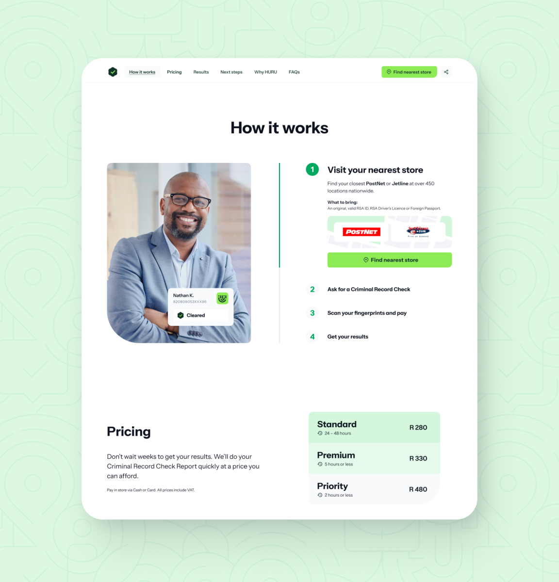
To compliment the site’s obvious navigation, we use simple, clear language, fewer words and short sentences to appeal to even the least proficient English speakers. We wanted to ensure clarity of the next steps, a seamless understanding of how the record check process works and clear directions on how to achieve it.





“